It is no secret that trends change year upon year, and colour is no exception. Besides the fashion industry, graphic design is also impacted by these up-and-coming hues, since they catch consumers’ eyes and help products to stand out on the shelf. One of the benchmarks in the choice of the colour par excellence that will be a sure-fire success every year is nothing more and nothing less than the Pantone Color Institute.
Moreover, its experts designate a series of palettes with complementary hues that help to combine this colour and open up a broad range of options, from the more moderate to the bolder and more explosive ones. This post revisits each one of them so you can make sure that your projects are in sync with the latest fashion.
Yellow and grey: 2021’s colour is split in two
While it is true that we already said that Pantone chooses a colour of the year every year, 2021 is special, and the Pantone Color Institute has come up with stwo hues that will regn together: Illuminating yellow (PANTONE 13-0647) and Ultimate Gray (PANTONE 17-5104). “Two independent colors that highlight how different elements come together to support one another”, as the experts from this institution point out, adding that it conveys “strength and positivity”.
The Geltex Narciso and Gris Frío are perfect for recreating them on paper, since not only do they have a very similar hue, but they also convey the same sensations as the Pantone colours of the year: yellow transmits happiness and vivacity, reminiscent of the sun’s energy, whereas grey conveys the solidity of robust foundations.
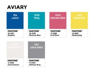
Aviary: tropical birds on paper
Shall we head for a tropical paradise? One of the palettes proposed by Pantone to combine the colours of the year is Aviary, “a lively and joyful grouping of color emblematic of vibrant and eye-catching rich bird plumage”. In other words, bright and cheerful hues that conjure up images of colourful birds. The combination is comprised of the two colours of the year, together with Skydiver (a deep navy blue), Peacock Blue (a turquoise), Fruit Dove (a powerful pink) and Cloud Dancer (a very gentle stone colour). In Geltex hues, one option for replacing these tropical hues is, respectively: Lago, Teal, Indian Red and Pistacho.
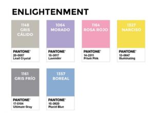
Enlightenment: the power of pastel hues
Enlightenment, the second proposal to be combined, is not very different in colours, although it draws more from pastel hues that are “evocative of a hypnotic space that expands our mind into another realm, the youthful and future-facing color story in Enlightenment stimulates our desire to reimagine”. For this reason, the Lead Crystal light grey (which we can achieve with the Geltex Gris Cálido), Lavender lilac (Geltex Morado), Prism Pink (Geltex Rosa-Rojo) and Placid Blue (Geltex Boreal) are used.
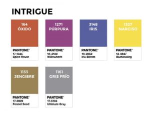
Intrigue: the universal appeal
A potpourri of influences, extravagance and individualism, “yet at the same time displaying a universal appeal”, is what, according to the Pantone experts, is evoked by Intrigue, much darker than the two previous options. To recreate this strength without seasons, the yellow and grey are joined by the Spice Route terracotta, Willowherb purple, Iris Bloom blue and Fennel Seed olive. In Geltex? Óxido, Púrpura, Iris and Jengibre will be the hues.
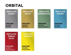
Orbital: interstellar travel on paper
Let us take a look at the penultimate palette of the year in a journey through the stars, brimming with “a palette of shimmering metallic tones found in the mesmerizing galaxies of outer space”. In this case, the Illuminating is replaced by the Luxe Lemon, a yellow version with highlights, and the Ultimate Gray by Chrome, a grey with the same finish. They are joined by gold (Glitteratti), green (Green Glimmer), blue (Heavenly) and red (Space Cherry), all of them metallic. To apply it to paper, we propose Geltex Reflejos, a variation of Guarro Casas’ most varied gamut, albeit with the same finish, offering an interplay of shifting lights and colours under the light. To achieve this, you can replace the Pantone hues, in the same order as we mentioned, with the following ones: Dorado, Acero, Pirita, Esmeralda, Zafiro and Ámbar Rojo.
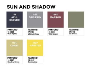
Sun and Shadow: the beauty of the earth
With “a palette of earthbound shades”, the colour experts sought to extract their final winning combination of this year, “from the primitive beauty that surrounds us”. This is achieved with the night blue of Blue Nights, a wine-tinged colour with Wild Ginger, the colour of the olive tree with Oil Green and the greenish-yellow Shadow Green, easy to apply on paper with Geltex Azul Oscuro, Maroon and Curry.
With all these highly different combination options, which evoke highly different images and memories, you will definitely find one you can apply in your next project, so we would encourage you to go ahead and let your creative flair loose on each one of these stories.