One of the visual factors par excellence that entice us to choose a certain container or publishing product is its colour: some hues convey warmth, others are more impactful due to their intensity, we like certain colours more or less depending on our visual education, etc. For this reason, when we plan a project, it is important to take into account not only the paper we are going to use, but also its colour. For this reason, we need to be conversant with certain aspects involved in its creation, as well as the manufacturing process, in order to get the right hue or the strength they offer depending on approximately how long the object will be used for.
How is colour paper formed?
Colour paper is formed using a raw material, namely paper fibre, which is white. The anionic dyes required to achieve the desired hue are added to this base and then they bind chemically to the cellulose threads by means of Van der Waals forces. They are added by means of metering pumps that regulate intensity as exactly as possible. For this purpose, the setpoints of each hue that are required to create the colour are entered into a colorimeter: this is essentially a mathematical formula involving a triple colour matrix.
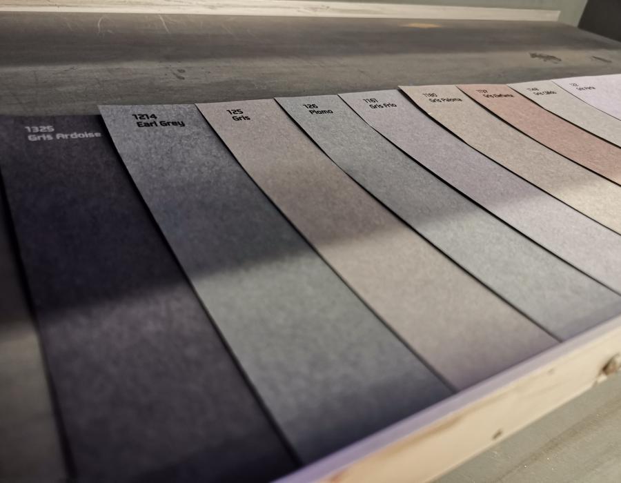
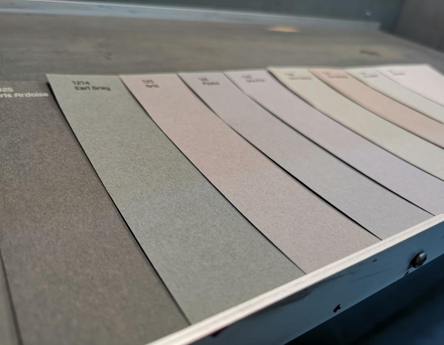
Therefore, CIELAB is the 3D colour representation model of this matrix based on three axes on which all the hues that can exist are built. The first one corresponds to L, which will set the amount of lightness (L*=100 represents white and L*=0 black); the second corresponds to a, which ranges from green (-a*) to red (+a*); and the third to b, which swings between blue (-b*) and yellow (+b*). Once the value to be input into the colorimeter for each one of the three axes has been ascertained, the machine pumps in the corresponding dyes until the target is reached. Guarro Casas initially has a catalogue with more than 300 colours and finishes. We also manufacture bespoke hues for customers on demand.
However, colour formation involves a great deal more than simply selecting these values. One of the main premises used at Guarro Casas is that ‘paper is alive’, and in this regard the fibre will not always absorb the dye that we want to add to it properly. In these cases, the final appearance is not uniform, meaning that it is important that we know how to set the colour in each case in order to achieve a quality and stable paper between manufacturing runs.
Colour tolerances and brightness
A colour’s tolerance establishes the variability it may have for it to be regarded as acceptable within standard production limits. In the case of Guarro Casas, these values are to at least 3 decimal points, because a minor difference could lead to a very substantial colour variation. This is why our quality is outstanding, because we have a very broad range with great reliability in the differences between them.
In addition to this, in order to achieve the brightest possible colours, it is indispensable to guarantee that the other dyes have no impact, since if this occurs the resulting material loses its intensity. When this happens, hues are not so well-defined and the colours present different nuances, affecting colour perception. Thanks to our long-standing tradition in the sector, our materials are outstandingly bright and intense, providing unique visual experiences.
Factors that cause visual perception to vary
Although a colour is created with a meticulous mathematical formula to yield the required hue, we should not forget that there are other factors that can affect the way we will perceive it once it is actually in our hands.
First of all, one important conditioning factor is light: observing a paper in natural daylight, in a LED-lit room or under fluorescent light is not the same thing. In fact, the colour that we perceive is a reflection of the light on the objects, meaning that visual perception may be different in each and every lighting situation. In view of this variability, and in order to make sure that the colour we have is the one we want, this process is normally conducted in daylight, even though we actually see the vast majority of products manufactured with paper on shelves in stores or in shop windows under fluorescent lighting. In actual fact, colour can even vary depending on our position: if we look at an object from different positions around it the hue may appear to be different.
Another important conditioning factor is a person’s eyesight: each individual will perceive paper as having one colour or another one simply because they are looking at it with different eyes. Here, other factors come into play, such as age or eyesight problems.
The third element that may change colour perception is related to the paper’s finish. Embossed papers create relief in the material and, as a result, shadows. These surface irregularities will lead us to think that the colour is darker than it actually is. Similarly, shininess can also change perception, as can other processes, such as lamination.
Moreover, some colours have a more subjective perception: shades of grey, or in other words those around 0 in the a and b axes. Due to their characteristics, a minimum variation in the dye or the light in these hues causes the visual effect to change substantially. This is affected even further by our visual education, namely the way we are used to seeing colours. By way of example, while Anglo-Saxons see the more yellowish hues as white, Latinos see hues with a bluish touch as purer.
Light resistance
However, and besides perception, another aspect to be considered are colours’ capacity to withstand the light and to avoid wear, depending on the chemical material they are made of. Returning to the premise of ‘paper is alive’, humidity and heat cause the material’s colour to lose its brightness. Traditionally, the colours that withstand the light best are those containing heavy metals (for example, dyes or pigments obtained from chrome were the most beautiful ones but they were also the most pollutant). In order to be ecological and reduce pollution, ever since chrome was prohibited we have sought to find alternatives that provide the greatest possible resistance in the most sustainable way.
Therefore, colour resistance is measured on an 8-point scale, although it is virtually impossible to find the maximum value on the market. In actual fact, the papers used nowadays may be regarded as disposable since they are not kept for long periods of time, meaning that they do not need to be that strong. Dyes, which can reach values of 5 out of 8, are sufficient for the use currently made of products.
Curiously enough, the colours that stand up worst to the light are the brighter whites; as well as violet hues, which change with the slightest variation in moisture (in dryer atmospheres or environments they tend to turn reddish, whereas greater humidity leads them to take on a more yellowish tinge).