Colour is one of the indispensable elements that define a graphic project, be it physical or digital, and can go a long way to influencing how objects are perceived visually by consumers. A hue can convey an idea or concept, it can take us somewhere, make us feel specific sensations… However, to do this, we need to know how to represent the desired hue depending on the substrate on which it will be displayed, using the different colour models and also know how to convert them properly to avoid unwanted variations.
But what is a colour model? It is a way of representing each hue numerically depending on the variables established in each one of these systems, so that different colours can be classified and easily replicated. To this end, each model uses three or four values (different base hues, lightness, saturation… among others), which produce a unique reference for each hue to be represented. They therefore become a kind of universal language for everyone who works with the same system.
Below, we recap on the four main models for colour formation with their constituent variables and the specifics that need to be considered. Moreover, in the forthcoming post of our Paper academy we will be looking at two companies that have developed their own colour palettes to extend the existing offer and the options available to design and creativity.

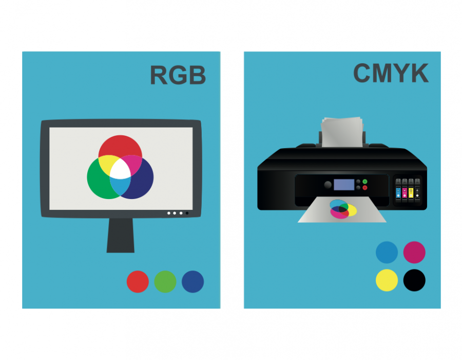
RGB: additive synthesis model for displays
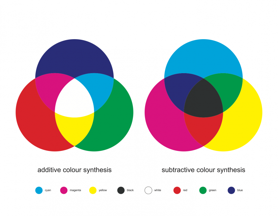
RGB is an additive synthesis model. To reproduce a colour, it combines, through addition, the light of the three primary colours: red, green and blue. Therefore, to generate a hue with this pattern, the three light beams are superimposed at their exact degree to achieve the desired outcome. This factor distinguishes it from another one of the models we shall see below and it is based on reflected light instead of emitted light.
We should also remember that the zero brightness of the three components yields black, the darkest; whereas if they are all applied in full then white light is obtained. If the three lights are applied equally, this yields a grey hue, which will be lighter or darker depending on the proportion applied. When the percentages change according to the R, G or B channel, this generates the mixtures that yield highly diverse hues, more or less saturated depending on the brightnesses applied.
The objective of this model is to represent colour on displays or screens, such as television sets, computers, video projectors, digital cameras, mobile telephones, tablets or other light-emitting devices. Depending on the device that emits the image, the perception of the hue can change, meaning that this factor must also be taken into account.
What is this colour model used for in the case of a physical product such as paper? For the hue sample, the manufacturer must tell the client the corresponding RGB so that the final result can be viewed on the screen in the closest possible way. Therefore, hexadecimal coding renders it simple to express any colour by means of this method.

CMYK: subtractive model for printed colours
Unlike RGB, the CMYK model is the one used most for printing, although it is also employed in the plastic arts, because it is more precise than the digital pattern.
It is a subtractive system based on the mix of four pigments, following the order of their abbreviation: Cyan, Magenta, Yellow and Key (Black). Many more hues can be created through the combination of these basic colours in a process based on light absorption. The colour that we perceive in printed objects is due to the amount of rays of light that impact upon it directly and are not absorbed.
By way of anecdote, the last colour, despite being black, is not called black in English, but rather Key. This is because in printing press times, a plate called a “key” was used which printed the detail of an image in black ink in order to provide better resolution. Therefore, this designation was maintained over time until the fourth pigment used for colour-forming according to CMYK was given this name.
This model is based on opposites. Cyan is the opposite of red, meaning that it acts as a filter that absorbs it, magenta does the same with green and yellow with blue. When they are superimposed in printing in the right proportion, the target colour is obtained, with the help of key (black) to generate a greater brightness of this hue which cannot be obtained with the other three pigments alone.
Thus, to print a paper, the printer must be given the measurements needed to be able to create the right combination of colour with the inks and obtain a precise and optimal result. In other words, if a digital file has been used and subsequently has to be printed, it is absolutely necessary to perform the conversion from RGB to CMYK to prevent the images obtained from having the same hues as the initial idea created on the screen.

CIELAB: 3D model of colours on paper
In this case, it is the colour model par excellence used by paper manufacturers and is closely linked to the visual perception of the tones in the material manufactured. The first part of the name comes from the organisation that created it: it was developed by the International Commission on Illumination (Commission Internationale d’Eclairage). The second part refers to the LAB colour space.
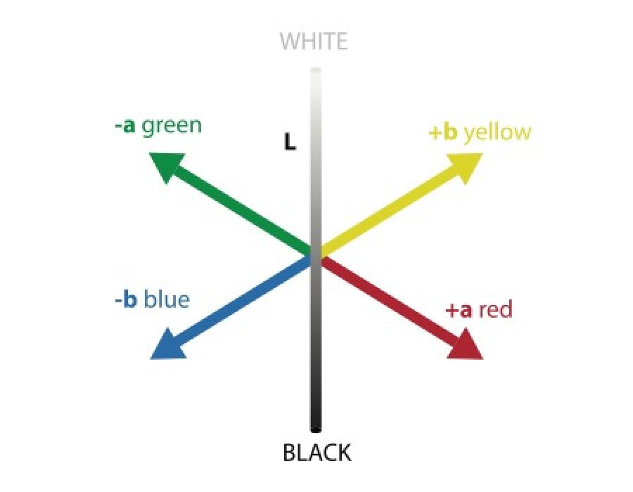
This colour system is based on the 3D representation of colour according to three axes on which all the existing hues are built. The first one corresponds to L, which establishes the amount of light (L*=100 represents white and L*=0 black). The second axis, a, varies from green (-a*) to red (+a*). Finally, the third, marked as b, ranges from blue (-b*) to yellow (+b*).
The combination of these three parameters gives rise to the desired hue and determines the value of each one of them to be entered into the colorimeter for the machine to add the colours or pigments in exactly the right measure until the desired result is obtained. Guarro Casas offers a catalogue with more than 88 colours in stock and currently manufactures over 100. We also create customised tones for clients or for specific projects with special needs.
The truly interesting thing about the use of this model during paper manufacture is not to know what exact colour is being produced, but rather to set the standard and measure the material being made at all times order to guarantee that it does not deviate from the established hue. In other words, it is used to calculate variations from the established base. For this purpose, the Mesurex tool plays a key role in this reading of variables to check that there are no problems.

HSL: cylinder model for greater colour depth
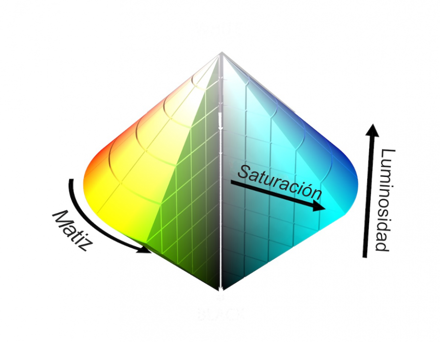
This abbreviation, which stands for Hue Saturation Lightness, refers to the last of the four main colour models we shall be describing. This cylinder system is comprised of three different channels. The first one, “Hue”, is equivalent to the shade or nuance. It represents the primary colours that we already know (red, green and blue), although it also represents all the nuances that are generated when these three colours are placed in the colour wheel. Red lies at 0°, green at 120° and blue at 240°.
Secondly, we have the “Lightness” variable, which determines the amount of light. When this value increases, the colour slides towards white, whereas if it is reduced it slides towards black. This channel is represented as a percentage, from minimum lightness or black (0%) to the maximum or white (100%), although it can also be expressed in a range between 0 and 1.
Finally, the third place in the cylinder is occupied by “Saturation”. When a colour is less saturated, it slides towards grey, whereas when it slides towards its maximum value it is much brighter. Just like the previous channel, these coordinates can be identified as a percentage or in a range of 0 to 1. Thanks to these three HSL “players”, the colour obtained yields greater depth and precision.
