
Colour models allow us to “standardise” hues between different designers and printers and communicate simply in the same language. In the previous post, we looked at las diferencias entre RGB, CMYK, CIELAB y HLS, recapping on their main characteristics and analysing their applications, although sometimes, the boundaries of creation go much further.
Some companies have set out to propose their own colours to generate new creative options that become available to designers, and have produced their colour catalogues with a different range of nuances and finishes. Therefore, these hues are obtained through the use of their own inks. What can each one of them offer design professionals?
Pantone: a trend-setting institution
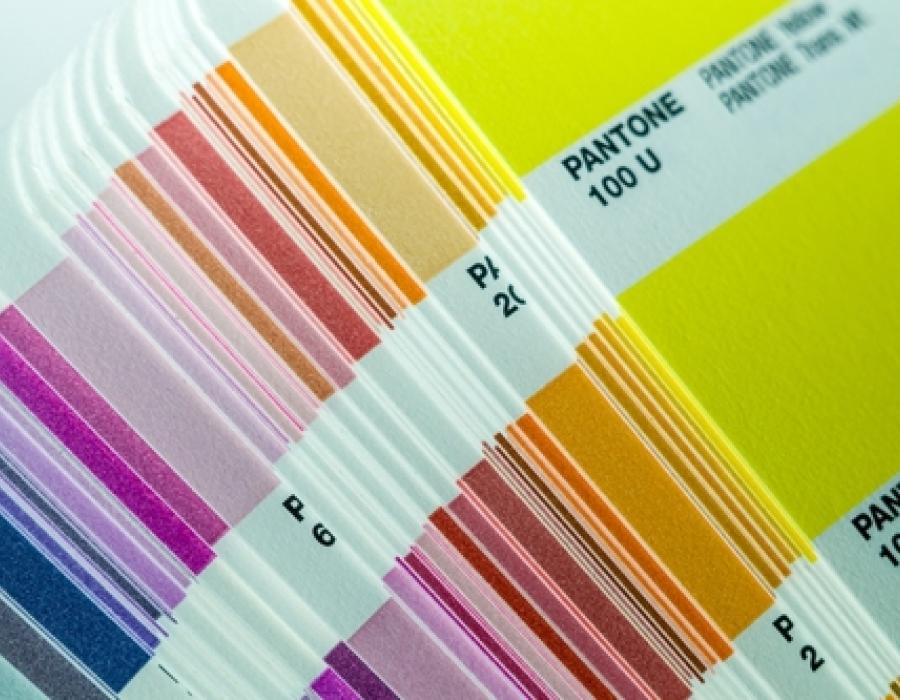
The first alternative to the main models is proposed by Pantone, which describes its objective in the following way: to provide a “universal language of colour that enables colour-critical decisions for brands and manufacturers.” The company in question, founded in 1962, offers catalogues with its own selection of hues that can be obtained from predetermined inks identified in the document. These “ingredients” are provided by the company in order to achieve the exact result. In this way, it generates its own palette, expanding the already widespread range of basic colours.
Each tone is identified by a number and abbreviations that refer to the material being applied, a coding which makes it possible to recreate each colour on the different surfaces on the market as exactly as possible. These categories are structured as follows: Matt finish (M), coated paper (C and CP, “Coated”), coated paper based on the European standard (EC, “Euro Coated”), uncoated paper (U and UP, “Uncoated”), textiles (TC and TCX, “Textile Colour eXtended”), textile finish (TPX, “Textile Paper eXtended”), opaque plastics (Q, “opaQue”) and transparent plastics (T, “Transparent”).
Over time, and thanks to the relevance it has attained, Pantone has become a veritable colour institution. Every year since 2000, it has established the trending colour for the coming twelve months, as well as suitable combinations, delivering ideas to creative professionals. It has even entered areas outside the graphic arts: the company’s influence has spread to fashion, home and textile decoration, architecture and interior design, accessories or web design.
While the options generated by colour models are practically infinite, “it standardises” new variations. Indeed, it has already surpassed the number of 1,867 patented colours in graphic printing alone.
HKS: German manufacturers as the colour alternative
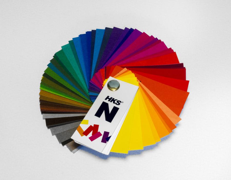
Germany is home to another one of the world-renowned organisations that have promoted their own colour chart, created through the merge of three colour manufacturers from this country: Hostmann-Steinberg Druckfarben, Kast & Ehinger Druckfarben and H. Schmincke & Co. This synergy gave rise to HKS, the abbreviation of their three names.
As also occurs with Pantone, the hues “standardised” by this brand can be used in all types of printed publications to reproduce them in the projects devised by designers from all over the world. Indeed, HKS offers more colour variations, despite the fact that it is less well-known internationally. The palettes of both institutions share the fact that they have certain specific hues in their ranges that cannot be recreated with the CMYK system.
The HKS catalogue is comprised of 120 plain colours and 3520 specific hues for coated and uncoated papers, meaning that it can also deliver distinctive finishes depending on the characteristics of the substrate being used. This German system is based on ISO 12647:2 and the standards established by FOGRA, meaning that it is guaranteed that they can be printed without any issues whatsoever in offset and using digital printing technologies.
HKS also has different guidelines available depending on the type of material being printed: HKS K for coated paper, HKS N for natural paper, HKS Z for newspapers and HKS E, focusing on continuous paper. Each one of the colours is properly identified with the corresponding letter according to the catalogue and a digit, making the system very clear and simple.