In a graphic designer’s creative process, one of the factors that comes into play is the material that you use to represent the values behind a specific project. Wladimir Marnich is a designer who works mainly with paper, besides being the brains behind the most important Guarro Casas projects, and who uses the company’s materials for a great many of his jobs. In this interview, he will be talking about the importance of paper in publishing and graphic design, how material trends change and how he approaches his projects, from the idea through to the final execution.
How did your collaboration with Guarro Casas begin?
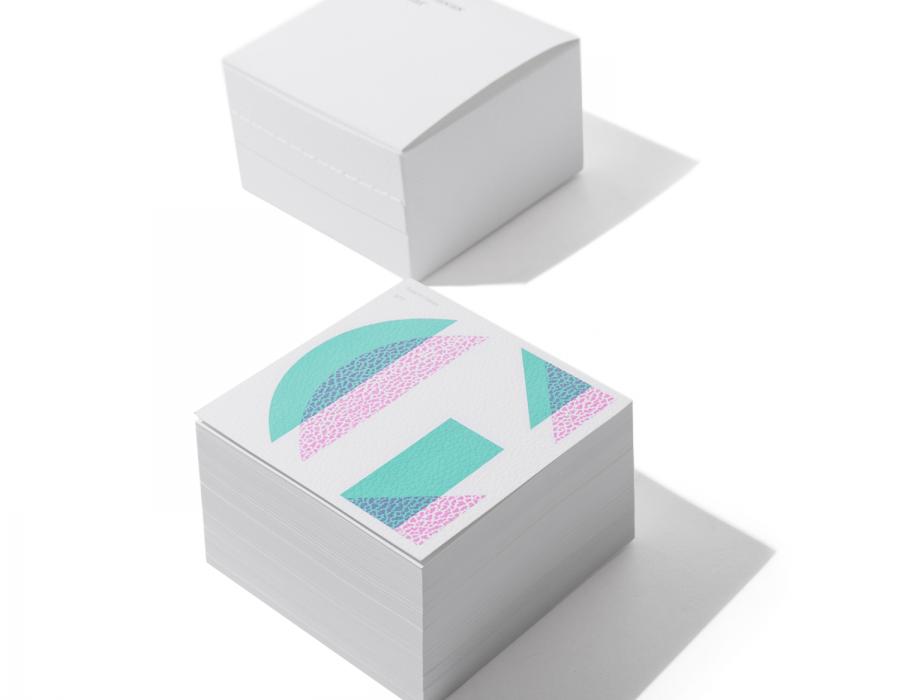
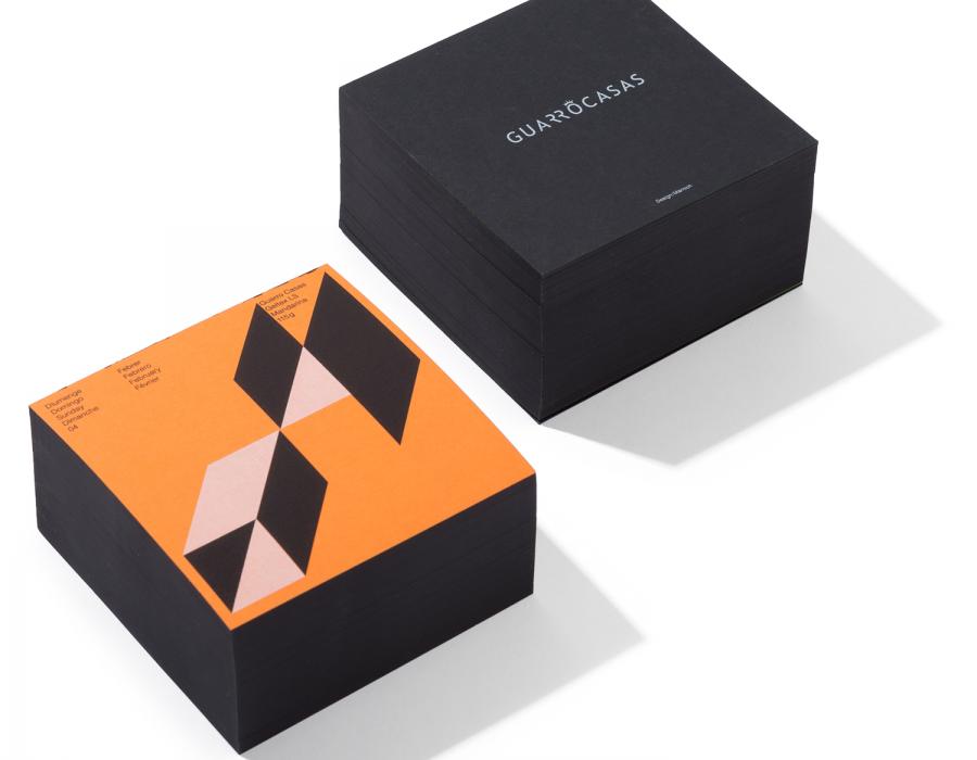
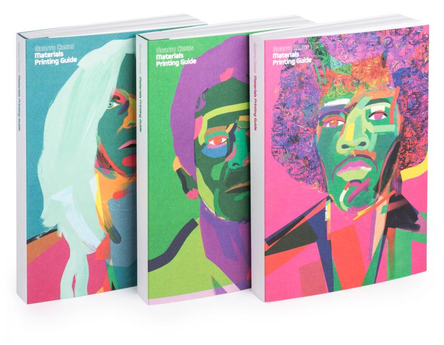
Well, in 2014, we sort of became the paper company’s official studio. The main project was to create the material catalogue, for which purpose, and instead of the traditional format, we proposed a box, which became the Yellow Box. In the meantime, we also supplied other jobs that they were doing, such as postcards.
Moreover, at that moment in time, for festive or holiday periods, Guarro Casas used to give its customers a gift in a box made with the company’s paper, so we turned that idea on its head by gifting a calendar. It struck us as somewhat odd that a company in the business of selling paper should gift necklaces or an object that had nothing to do with its core activity. This accessory was underpinned by an artistic concept and a designer was commissioned to create a unique item. Although to my mind, it was more important to show people what you do, find a way to explain it and that you would always remember who had given you the object as a gift, which in this case was a calendar showcasing the Guarro Casas papers.
Where does the concept behind each calendar come from?
The first thing I do is to find a material in the catalogue that gives me an idea to work on. For example, in the first calendar, I went for the variety of colours in the Guarro Casas offer and their brightness. Therefore, the first step in the project usually involves focusing on finding one or several attractive types of paper and then seeing which one gives me the greatest number of ideas. Although sometimes the idea occurs first and a special material is created for it. For example, and although it is not a calendar, in the case of the Yellow Box a special yellow paper was produced — one of the advantages of working with the customer who makes the paper: it allows you to offer the option of creating customised projects.
Besides this paper-making company, what other sectors do you usually work with?
Up until 2014, my studio worked with all types of clients. However, that year, I decided to go for a professional change and started to work for myself in design, focusing on the world of art and culture, which I have done up until today. This means that I only work with museums and some cultural organisations, so Guarro Casas is the exception.
What is graphic design for you?
Graphic design is born of a client’s need to communicate what they do or what their product is. The designer’s job is to accommodate this communication in the best, most attractive and most visual way possible. In the case of museums, we do this through posters, the exhibition catalogue, etc.
What material do you use most in your projects?
Definitely paper. And particularly because of a personal preference, since I tend to avoid technology unless I really need it to complete a project involving digital design. As far as I am concerned, it all starts with paper, because it is a material that I like and in which I have gradually specialised. Moreover, paper allows you to create an object that appeals to your sense of touch and lasts over time.
How does the choice of a specific paper help to transmit a brand’s identity or values?
Through their appearance and sense of touch, papers can convey certain sensations or qualities, and we designers can “play” with them for brands or products. For example, some materials are traditionally associated with deluxe products, such as coated paper, identified with quality thanks to its glossiness. At one point, this value was questioned, or other types of paper emerged, and designers either became tired or bolder and began to use new materials, to such an extent that coated or gloss paper was eventually regarded as cheap. Then came the time of non-coated papers and more offset. At the end of the day, it is like the fashion world: you use one trend so much that you end up hating it and have to find another way of communicating through materials.
Some papers are inexpensive to produce, although depending on their finish or the use you are going to make of them they take on a value that transcends what it cost to produce them. Indeed, there are some very powerful brands that can use a very economical recycled material which all of a sudden takes on an importance that it did not intrinsically possess. The use made of the material is therefore very important, irrespective of its characteristics. It also depends on the project: a paper for a supermarket promotional flyer will not have the same value as one used for a museum catalogue featuring pictures of key artists. The material is the same, the only thing that changes is the way it is used.
As a professional who has worked in different countries, do you think that the value of paper changes in the different places in the world or cultures?
I would like to think that it is the same everywhere and that it is something common to all professions: some design studios attach great importance to the choice of paper while others do not, or there are clients who place great value on it while others simply want the most affordable option. Perhaps the fact that I have worked in very similar cities, such as London and Barcelona, where design and publishing questions are addressed in the same way as fashion, has influenced me as well. Barcelona is a city with a great publishing culture and therefore automatically takes great care of these aspects. Perhaps in China, India or Arabic countries, the concept of paper changes, because their cultures are different, although for the moment I cannot really say.
What are the trends in graphic design?
Now there is a greater tendency towards creating things that are different from the rest, although this does not stop trends from emerging. In other words, you see something by another designer, you like it and you fall into the trap of continuing in that line you had seen and liked. The main sources of inspiration change gradually, because we get tired of seeing the same thing all the time, which is what happened with coated paper. For example, some years ago there was the fashion of having books with deckle and stitched edges, although everyone eventually ended up doing it and the novelty was lost.
The thing is that now you try to be a cut above the other trends that have been around for a long time. If coated papers are no longer in fashion, then perhaps it is time to give them another try. The same thing may be said of embossing: it was regarded as an outmoded finish, associated with the traditional encyclopaedias, but now it is applied in multiple ways in publishing projects with more up-to-date finishes. Ultimately, it is a question of doing away with the idea that people traditionally had of a given type of paper and of doing something different with it.
This is why it is very difficult to talk about trends, because trends change very quickly and something that is all the rage today might be out tomorrow; or because they have existed for so long that they simply cease to be fashionable, which is when you have to try something totally different in order to stand out.
When you begin a new project with a client, do they normally come with a preconceived idea or are you given a free rein to come up with innovative concepts?
It depends a great deal on the client, but in most cases I have total freedom, although it will be limited by aspects such as the number of pages, size, the number of sheets in colour or black and white, etc., unless the briefing is totally open, which is when you can bring all your creativity into play. At the initial presentation you already begin to negotiate specific details with the client. Part of the designer’s value lies in understanding the client from the outset of the project, so you know when you can submit more daring options because you know they will accept them.
Do you intend to continue in the world of art and museums?
Definitely. It is a world that I enjoy and one that lets me do the type of design that I like. When you create an exhibition, its title is still essentially a brand, and you then apply it to different media: you create a brand, a poster, a flyer or leaflet, an ad and then you transfer it to a catalogue or a book. You are covering all the possibilities of graphic design. Indeed, sometimes new clients ask me to do projects that would oblige me to put a team together again, but for the moment I would rather continue to work on my own and take on commissions I can manage by myself.


