
When a graphic project is devised, either for the publishing or the packaging sector, the trends that have been defined as dominant for the year take on particular relevance. The colours, typographies, styles and finishes currently in vogue can make or break a design as well as a cut above the extensive offer on the market, catching consumers’ eyes. We shall now take a look at the lines that will be all the rage this year and which we will see in all types of formats.
Classic blue and impactful combinations
One of the stand-out elements in a design is the colour chosen to transmit a product. Although there is an increasingly greater diversity of different and special hues, the Pantone Color Institute experts have chosen a traditional hue this year as the Color of the year 2020: Classic Blue (PANTONE 19-4052). Year in, year out, and according to the actual organisation, this annual choice impacts “product development and purchasing decisions in multiple sectors”, including product packaging and graphic design.
This classic blue takes on even greater relevance in view of the tendencies we will be seeing and which tell us that we are moving towards simpler and more minimalist designs. For this reason, the significance of this colour may be summarised as “tranquillity”. According to Pantone, this colour is “a timeless and enduring hue elegant in its simplicity. Suggestive of the sky at dusk”.
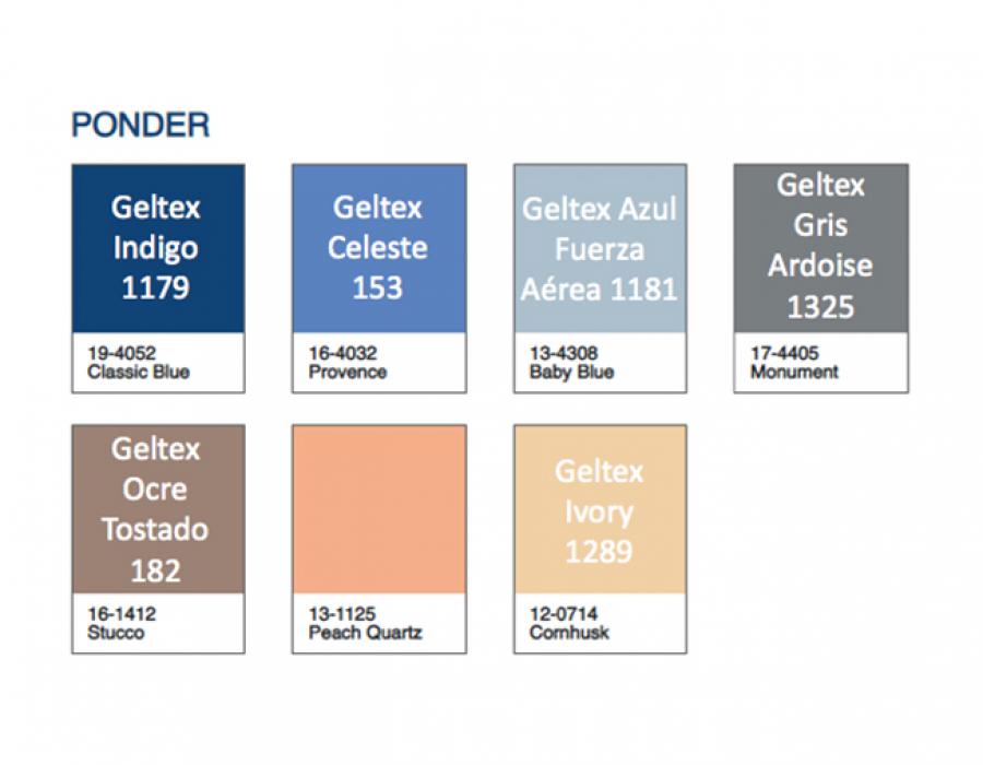
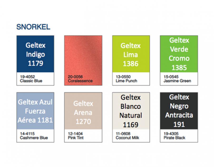
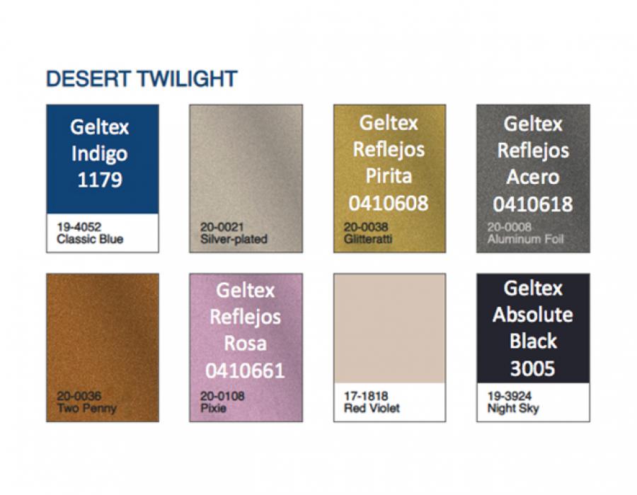
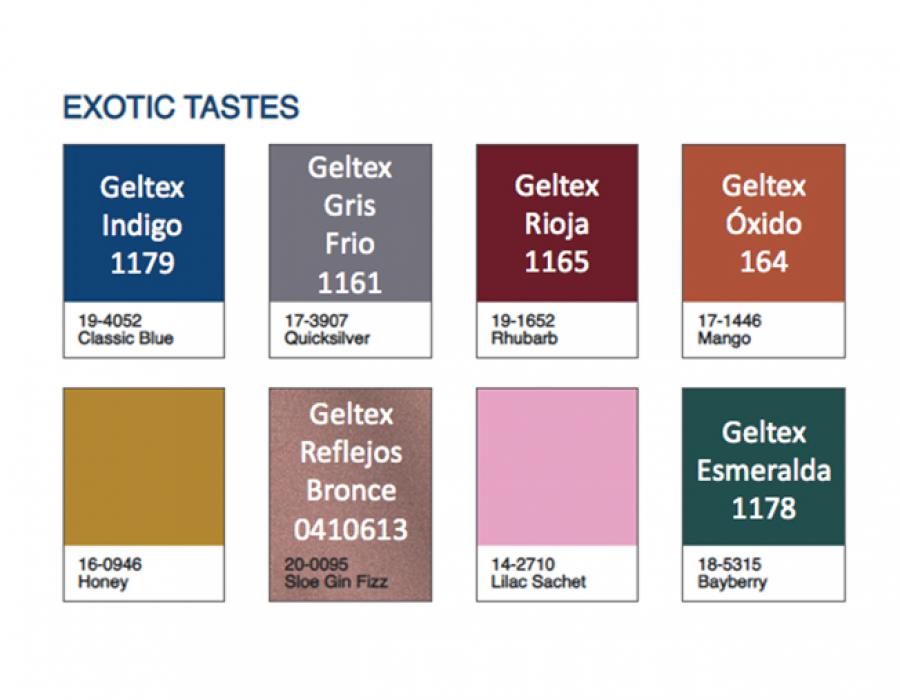
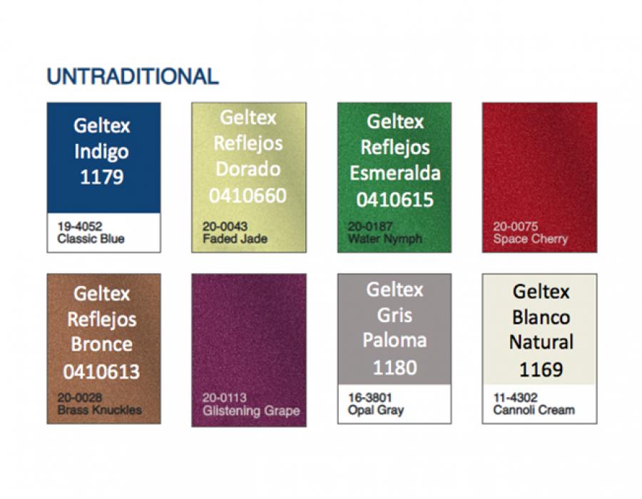
To complement the classic blue and to offer matching colours, this Color Institute also makes designers’ lives easier with five pallets reminiscent of the elements of our environment, based on different moods. From Ponder, a relaxing and reflexive combination that combines gentle cold and warm hues; to Snorkel, which whisks us off to a tropical paradise and its happiness by merging more acid and pastel colours; also taking in an evening sky with blue and gold hues through Desert Twilight. They are complemented by Exotic Taste, an array of different colours that evoke cooking seasoning ingredients from all over the world, and Untraditional, the most dazzling and unusual mixture featuring very different, powerful and impactful shades.
Monochromy and metals
Unique effects, also in the spotlight in 2020. The GraphicMama resource portal for designers presents the effect of monochrome colour, which will be calling the shots this year. When combined properly, this style can generate a far greater impact than over-using hues on the same cover or on packaging does. It is devised in opposition to the plethora of colours and forms that prevailed in the past and advocates simplicity.
Metallic colours become the perfect ally to oust monochromy. Both its typographies and details can help to draw consumers’ attention to the point where we want them to be. Moreover, golden tones convey a more deluxe and classy finish.
Days gone by and minimalism
As we already said, decades gone by are back with us in design to reassert the simplicity of the past. This 1950s-based inspiration is embodied in earthy colours and hand-drawn illustrations, according to GraphicMama, and will be combined with the search for styles that remind us of nature and all things organic.
Another decade shaping up again is the 90s, in an attempt to recover the most basic lines in the wake of so much overkill. Among other things, we will lose our fear of blank spaces, letting projects breathe, replacing this fear of the purest of tones with a sense of elegance.
Two lines of typographies
However, apart from colours and finishes, typography is also an essential element in transmitting a message, not only through the meaning of the text but also through the values transmitted by its forms. Indeed, when this component is treated with due rigour, a project can truly be a cut above the competition’s offerings. In this regard, in Creativebloq, Davide Baratta, Impero’s creative design director, emphasises that “typography and fonts are being used increasingly more as brand-defining elements”.
This factor is diversified in 2020: from simpler lines that sit well with the prevailing minimalism ethic to exuberant, striking or 3D-distorting forms, to mention but a few. Therefore, the typographies embrace the objective to be accomplished and assist in the personalisation and creation of identities.
Personalisation and sustainability
Finally, all these trends will come together in two major design lines that mirror society’s current concerns and tastes. On the one hand, nobody would ever deny that sustainability has become a must. The materials chosen tend to be more ecological and environmentally-friendly, in both the manufacturing and subsequent recycling process, meaning that they must be included in projects.
In fact, it is not only about the final outcome, as the manufacturing process must also be taken into account. In an interview given to Infopack, the vice-chair of the Instituto para la Producción Sostenible [Institute for Sustainable Production] (IPS) Gema Gaspar emphasises that “only a sustainable industry, one that seeks to be carbon-low, more efficient in the use of its resources, minimise waste, be more competitive and less polluted has its niche”.
This concern for the environment and ecodesign must be combined with a growing trend towards personalisation which consumers have been demanding for some years now. The sensation of having something exclusive and customised for the subject is gaining even greater traction, and technologies such as digital printing allow us to accomplish this objective. “When a company tells a story through its packaging, it manages to connect with consumers in an individual way and the product becomes irresistible”, we are assured by the DesignerPeople Asian agency. In order to achieve this, and by way of example, the use of personalised images and illustrations will increase this year and will prevail over archive photos.